Goodbye to the old campanile logo that we all know and love and say hello to Tech’s surprising and somewhat controversial new logo.
Met with lots of backlash from the student body for its apparent poor design that looks like it was made in Microsoft Word, the new logo is a part of a campus-wide rebrand that is an attempt from the Institute Communications to give Tech a more “modern” and “inclusive” feel to its brand-identity and to better align its academics with its athletic program.
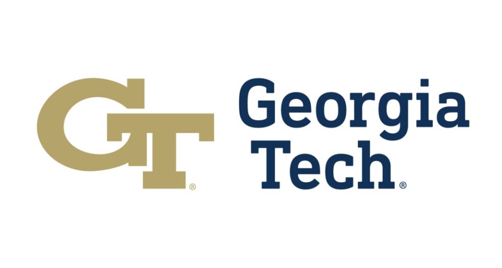
So what’s changed and why does it matter? For starters, the typeface now looks much more rounded and arguably more feminine and modern. A pro of this change is that the font visually shows a “lighter” and “creative” side of Tech compared to the previous font which appeared much more bold and aggressive with a masculine, industrial edge to it.
While choosing a more inclusive font was a great idea, many students agree that the specific font was not the right choice. Rather than representing a higher level institution, students think the logo’s font looks elementary and not as professional as the previous logo.
When placed next to the interlocking GT logotype, the font looks mismatched and slightly condensed, which results in a busy image rather than the originally-intended minimalist look.
In addition, the “T” in the logotype doesn’t line up with the “T” in the typeface, which looks like the words “Georgia Tech” were merely copied and pasted next to GT logotype rather than purposely placed there.
From a design perspective, we think that choosing a font in the same family as the logomark and realigning the typeface and the logotype would give the logo an overall more cohesive, professional look that aligns better with how the Institute wants to present itself.
Another change in the logo design is the color choice. Instead of a monochrome design like in the campanile logo, the new logo is now gold and navy blue, which reflects the recent change in Tech’s color palette to Tech gold, navy blue and white. We think that having two colors splits the image in half and doesn’t look as visually appealing or unified as using just one color. There is a design trend among higher institutions and corporations that’s moving away from the original, detailed logo designs and towards minimalism. If you look at prestigious educational institutions like Harvard and Columbia University, all of their logos and brand identities look virtually identical, with the university’s seal on the left and the university’s common name spelled out on the right in a simple font — Tech didn’t just think of this change overnight.
With the recent rise in Tech’s national ranking as a prestigious, well-known university, we think that the institute is trying to mold its brand to keep up with the other prestigious, household-name higher institutions to appeal to prospective students.
Between the addition of the exhibition hall and the new student center being built to getting rid of the Tech Trolley, one thing is for sure — campus is changing, and Tech is moving further and further away from the geeky school it used to be that many students knew coming into college only a couple years ago.
It feels like Tech is obsessed with competing and innovating, rather than fostering the quirks that makes the school unique. Before the start of the school year, the institute’s logo wasn’t something that many students thought about or had much of an opinion on. It was just something that was ingrained into everyday life as a Tech student, and students are now only paying attention to it because of the sudden change. We are not used to the way it looks yet, so it inevitably looks strange to us.
At the end of the day, it does not matter what font size or colors are in our logo. All the changes that are happening on campus are making it hard for students to feel at home here and find familiarity.
We want to preserve the Tech that we all know and love.