Volume 109, Issue 1 of the Technique is an important publication that focuses on highlighting Pride Month in an effort to shed light on campus organizations, news, entertainment and sports relating to the LGBTQ+ community. In the preparation for publishing special issues like this one, the artistic elements seen throughout the paper are given as much importance as the written articles that span 16 pages.
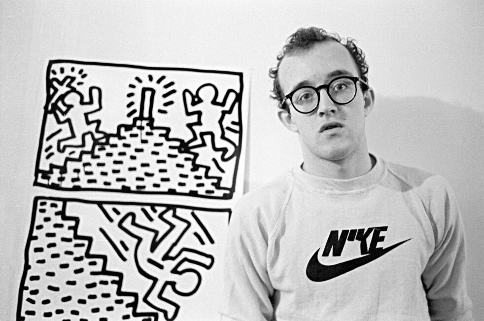
For the 2023 Pride Month Issue, the cover art takes inspiration from Keith Haring, an American artist whose work became popularized in the 1980s. His work began in the New York subway system and included graffiti elements, with unique, brightly colored designs that are easily distinguishable even today.
Haring advocated for making his art more accessible to the general public, rather than just wealthy art collectors. To do so, he established the Pop Shop in Soho that sold merchandise with his art on it. Haring also had a philanthropic streak; between 1982 and 1989, he created artwork highlighting social issues and donated it to charitable organizations. Some of his most famous pieces include his anti-drug “Crack is Wack” mural and his mural on the western side of the Berlin Wall prior to its fall.
In 1989, following his diagnosis of AIDS, Haring developed the Keith Haring Foundation that would preserve his artwork and give grants to children, along with individuals who were affected by HIV/AIDS. Following Haring’s diagnosis, his art intertwined themes of homosexuality with those of safe sex practices, positively showcasing gay love and raising awareness regarding HIV/ AIDS. Specifically his work titled, “Silence = Death” was used in AIDS campaigns and played on themes of persecution of members of the LGBTQ+ community during the Nazi regime in the 1930s and 1940s, and served as a symbol of recognition of the identities of queer people.
His work aimed to encourage individuals to embrace their identities and create more just and equitable communities.
In terms of specific inspiration for this cover, “Icons 3,” “Radiant Baby” and the Pop Shop series served as major inspiration for the cover among Haring’s numerous works. A common element in Haring’s artwork is the use of thick black lines for subject outlines, indications of movement and abstract doodles. Haring’s artwork is often wild and colorful, using bright, eye-catching colors which compliment the already dynamic people and doodles in his art. His artwork normally does not include any kind of shading, instead opting to fill in subjects completely. The goal behind creating the “Pride Month Issue” was to encapsulate the freedom and joy of the LGBTQ+ community through the use of bold colors and abstract doodles like those used in Haring’s artwork.