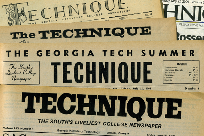
When I began this incredibly long journey of redesigning the Technique, I had no idea what I was getting myself into. On a week-to-week basis, our staff, myself included, is spoiled to use the tools, templates and styles developed and programmed by editorial boards of yore and we never, ever, peek behind the curtain for fear of permanently breaking a vital part of our paper. Needless to say, actually diving deep into the Technique stylesheet and template was an eye-opening experience.
Initially, I proposed the concept to Kamna, our Editor-in-Chief, simply as a way to improve the look of the paper. Over the years, new content drove the addition of small repeating segments, such as Campus Crime, Council Clippings and City Scene, each with its own distinct, and often poor, design. This disjointed vision certainly did not represent the paper well, as a whole, and made people with a design-centric background, such as myself, cringe.
“Ultimately, we at the Technique consider any and all feedback from our readership.”
And thus began an almost six-month journey to what you have in your hands today.
With the help of our incredible talented design editor emeritus Brittany Miles (who, both fortunately and unfortunately, is studying abroad Down Under this semester), I poured through font after font, went through countless revisions and garnered input from a variety of people at the Technique, on Tech’s campus and even from schools from around the country. Visually, the new Technique is exactly what we had hoped to come up with at the inception and is a drastic departure from our previous, and admittedly dated, design.
However, as the process moved forward, it became evident that there was a massive opportunity to not only remake the look of the paper, but to reevaluate every portion of our content, ensuring all parts are truly a worthwhile use of valuable real estate within each issue, especially to our readers, you, the students, faculty and staff of the Technique. The readership of any publication should drive the published content. After all, what is a paper, website or even Twitter feed without its readership? We believe it’s absolutely nothing.
This fundamental question has led to the omission of some older segments, and even the addition of some newer ones. And, more importantly, this led to a major refresh of our online presence. Not only have we refreshed the look of our aging website, the site is optimized for any size screen you may own, from smartphone to desktop. Definitely take some time to check it out at nique.net.
You’ll also find our newest addition to the Technique: Around Tech. Again with the reader firmly in mind, we’ve built a robust platform where student organizations and outside businesses, alike, can share events happening on and around campus. Not a traditional campus calendar, Around Tech works to provide a variety of events that are of interest to students.
Ultimately, we at the Technique appreciate and seriously consider all feedback from our readership. Please do not hesitate to contact either Kamna (at [email protected]) or myself (at [email protected]) if you have any questions, concerns or comments about the redesign or even the Technique in general. I sincerely hope you enjoy the new Technique and look forward to continuing to produce the South’s Liveliest College Newspaper.
